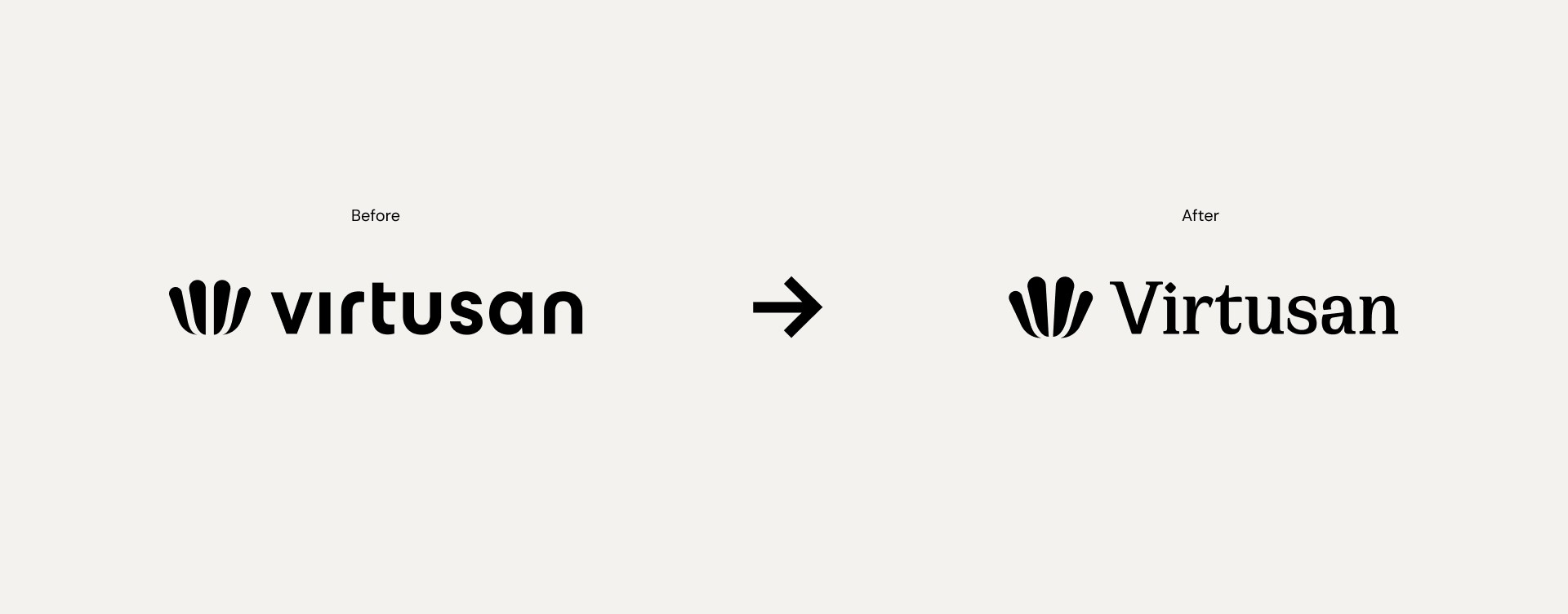
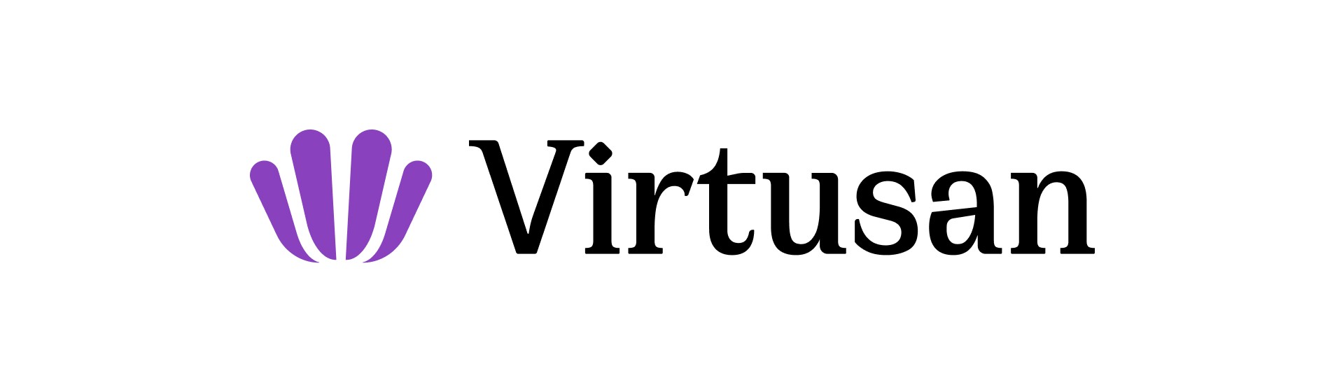
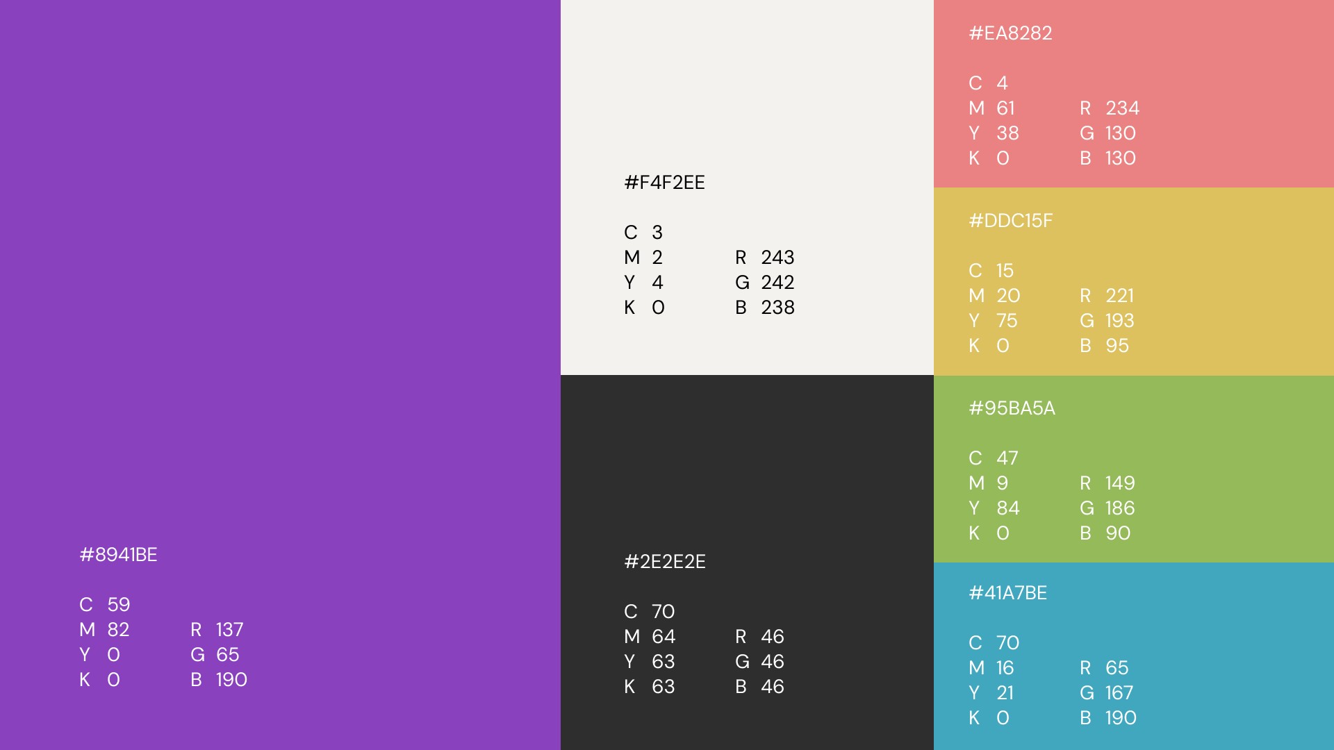
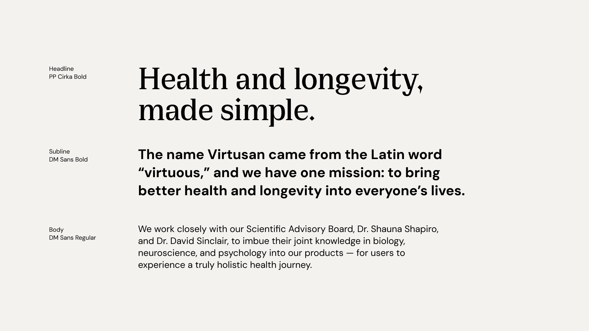
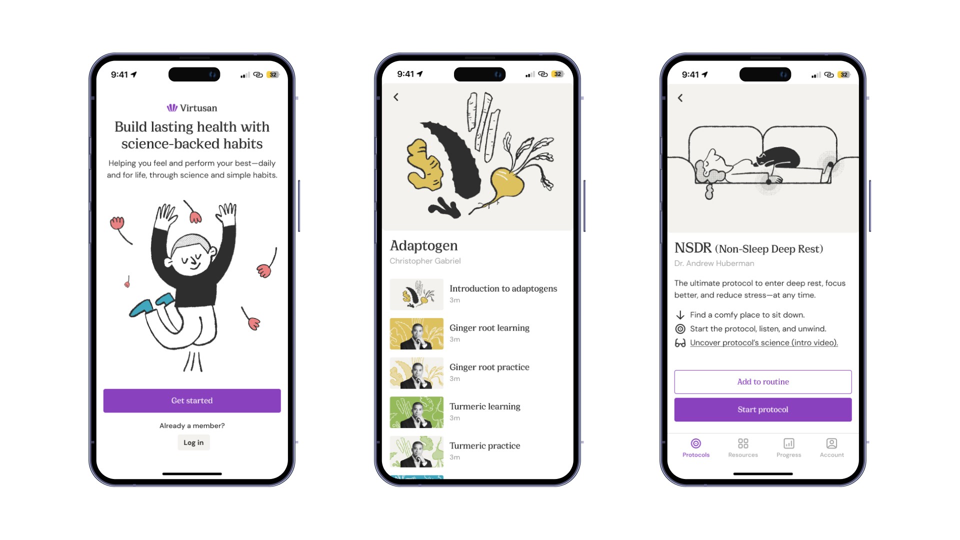
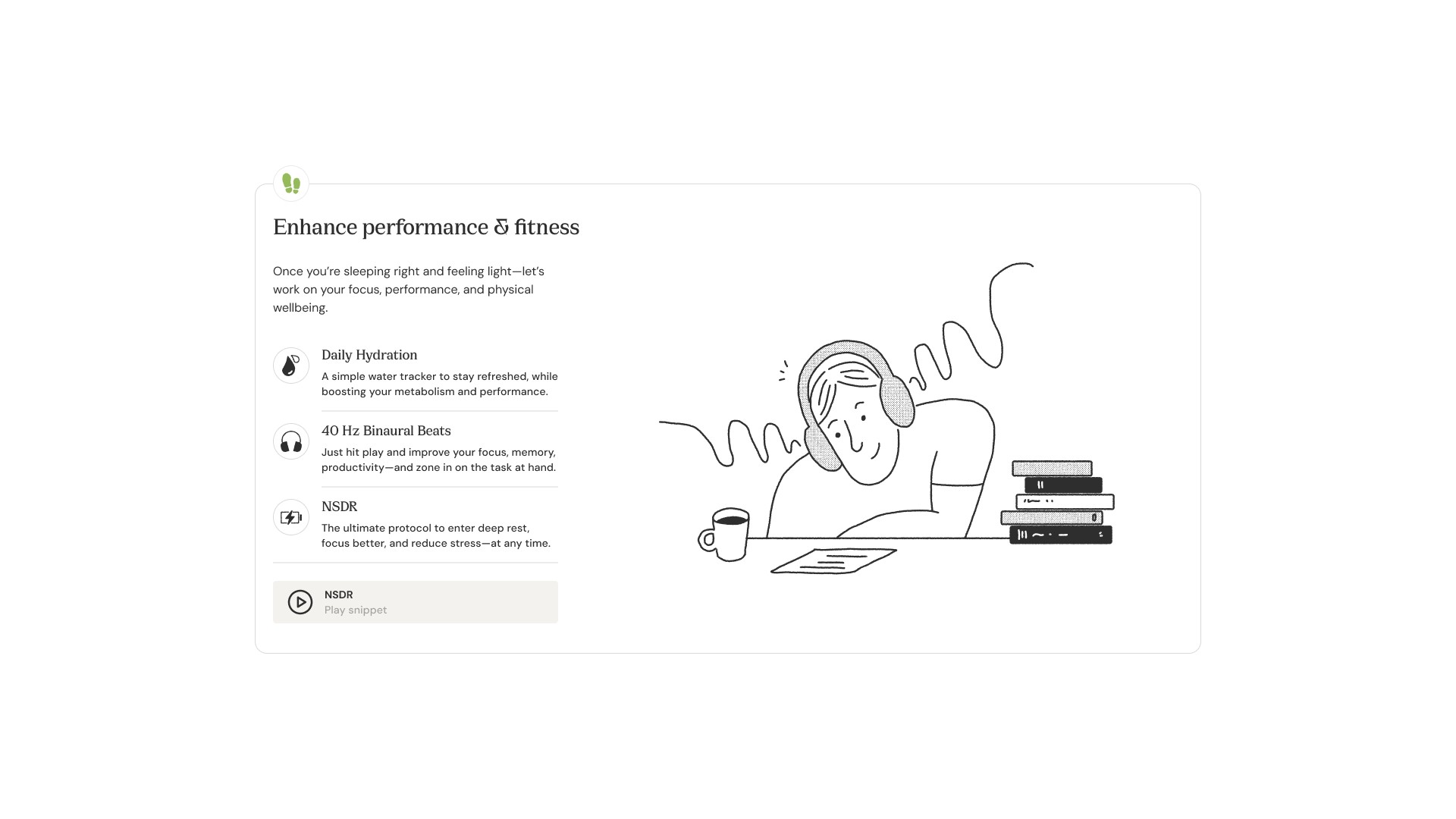
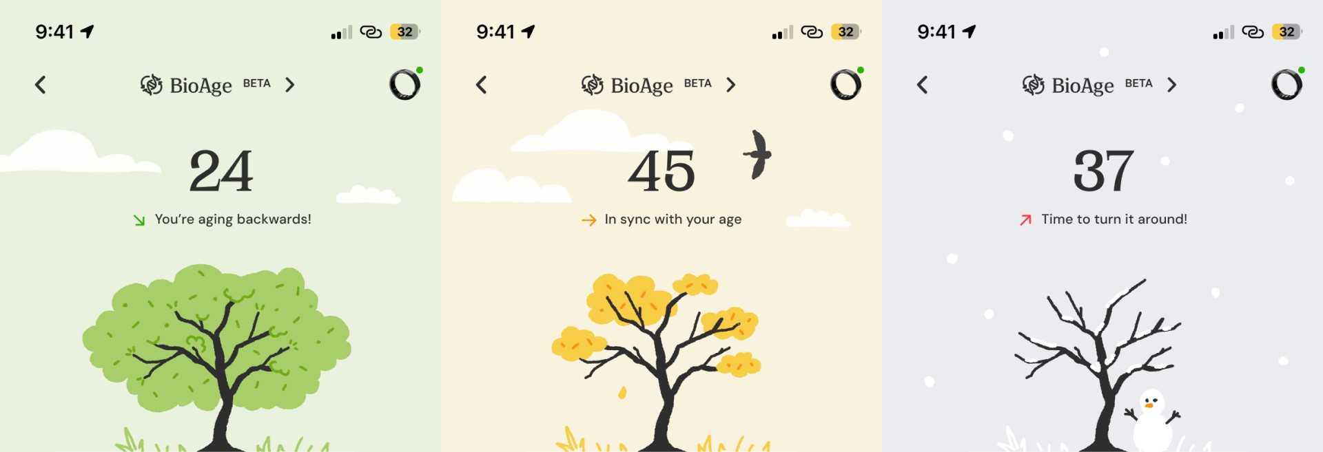
I rebranded Virtusan with a new illustration style that feels fresh, engaging, and true to the brand. I worked as a graphic designer at the health tech company Virtusan, leading its rebranding. Using line illustrations, I aimed for a more user-friendly look while ensuring the brand still felt credible, as all Virtusan principles were developed in collaboration with world-renowned scientists. To balance this, I used warm purple as the main color. Beyond branding, I created all social media images and videos, product promotion videos, and packaging. I also designed in-app animations as JSON animations. The goal was to make it more cohesive and memorable while adding personality.
Year
2024
Category
Branding

Illustration
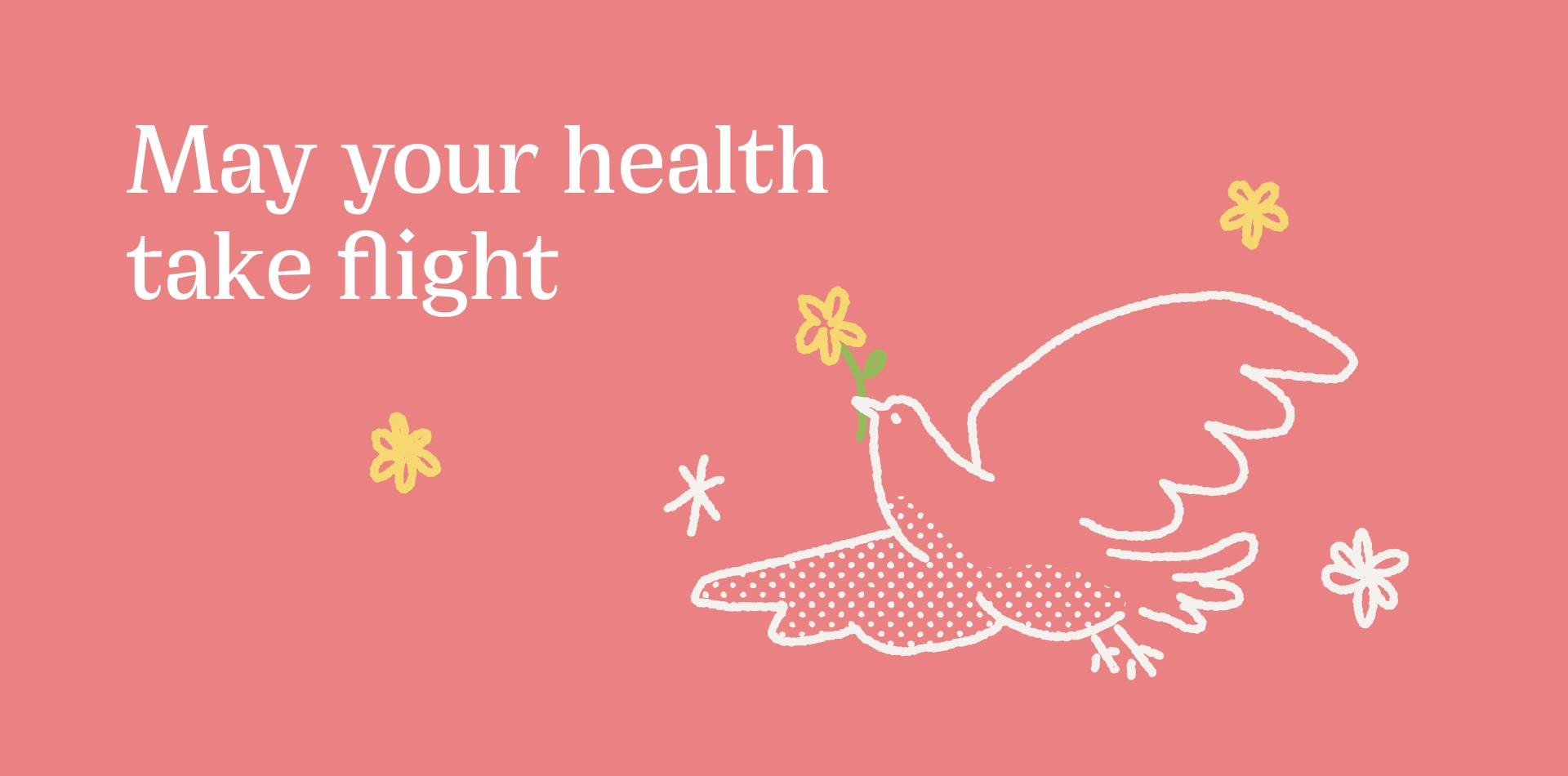
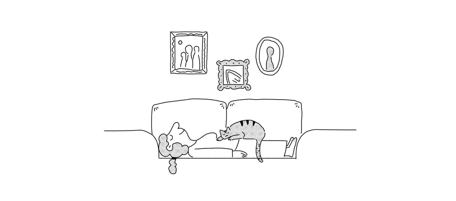
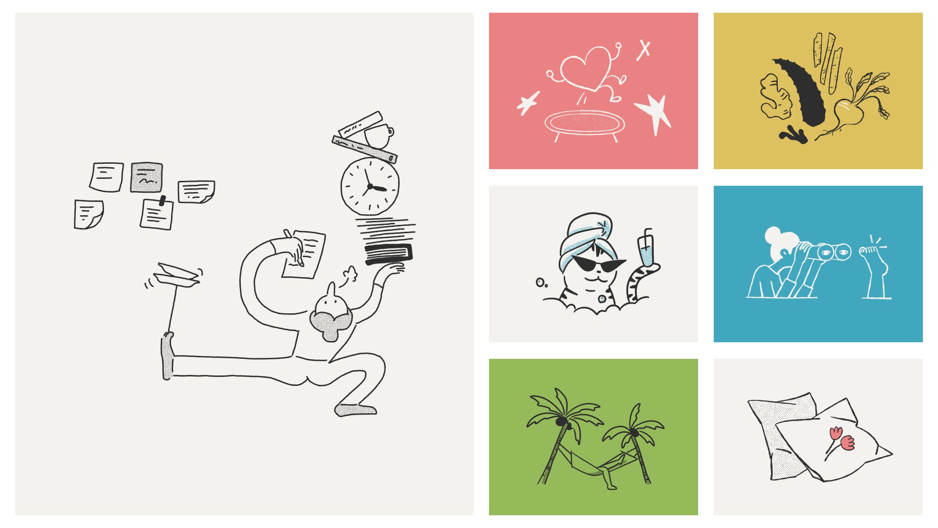
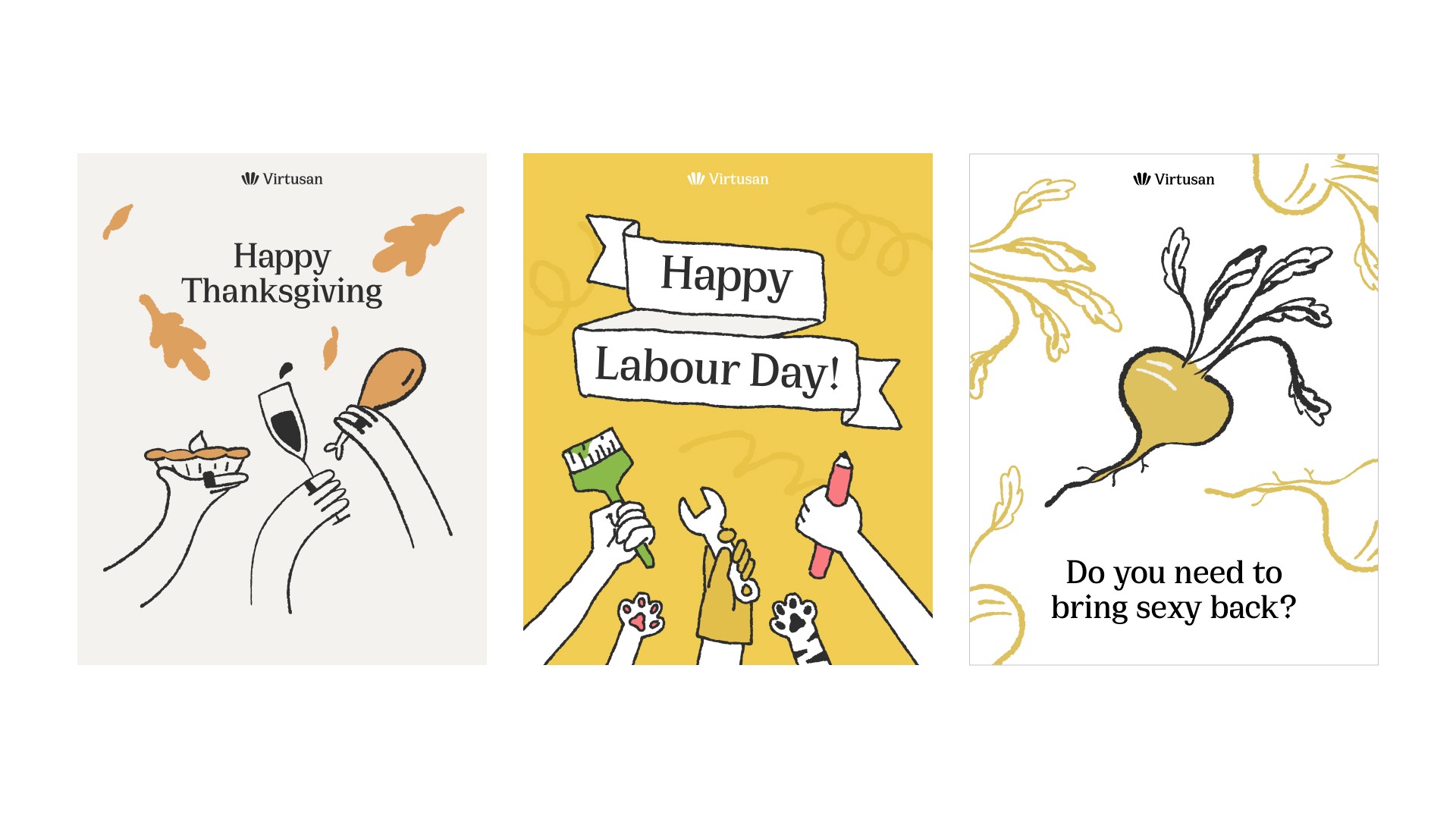
I used a hand-drawn line illustration style that blends friendliness with sophistication, combined with halftone patterns, to align seamlessly with the brand’s tone.
Social media
/Campaign
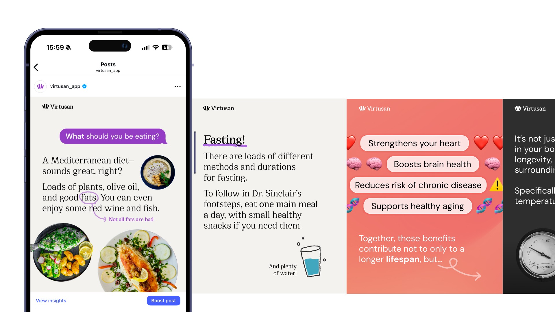
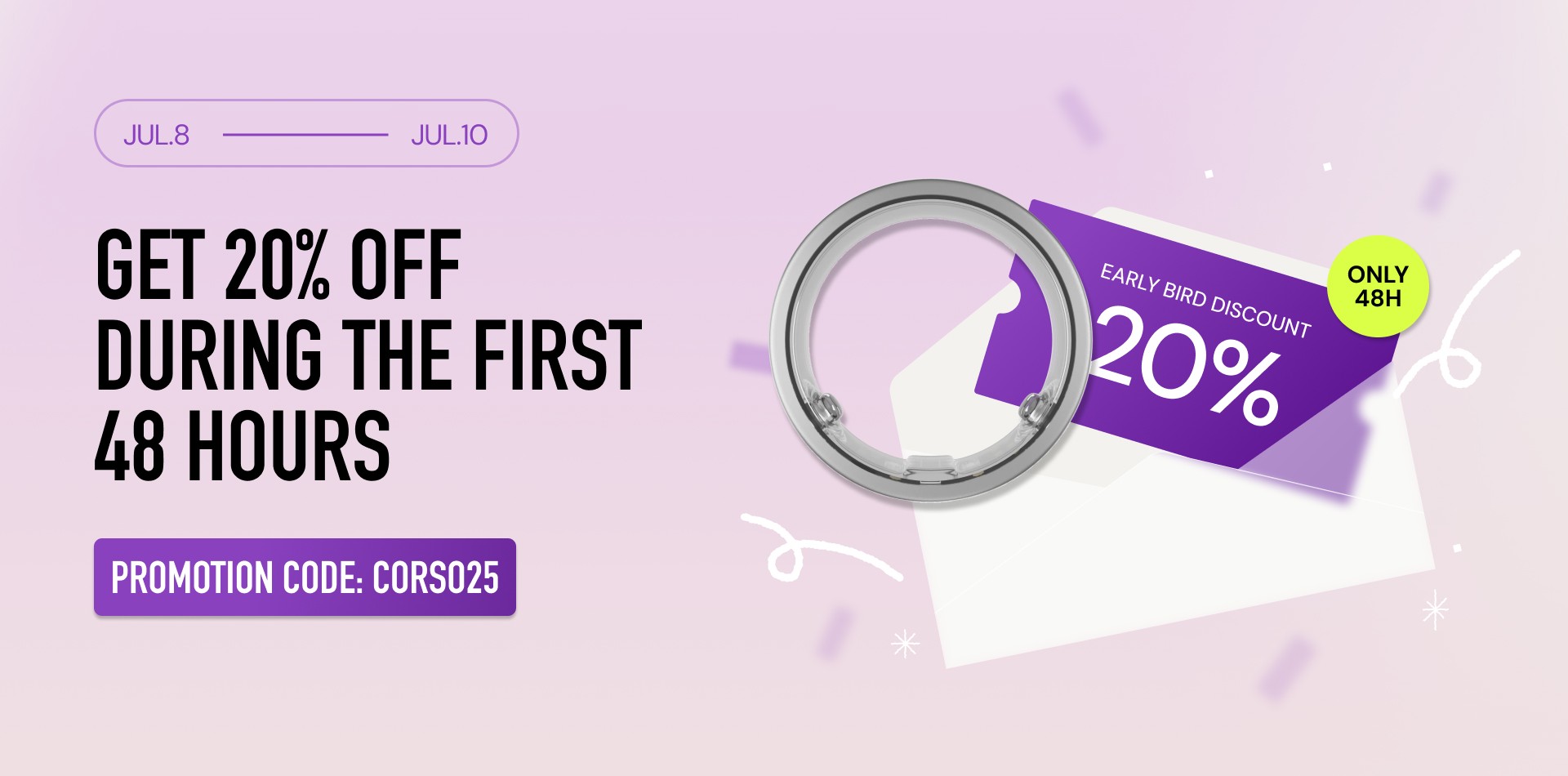
On social media, I designed informative content using friendly illustrations and layouts to connect with Millennials and Gen Z. Instead of writing long captions, I used carousel posts to make the content easier to read, which helped increase views by over 3 times compared to the previous year. I also edited promotional videos for the Virtusan Ring campaign and created animations used in the clips.

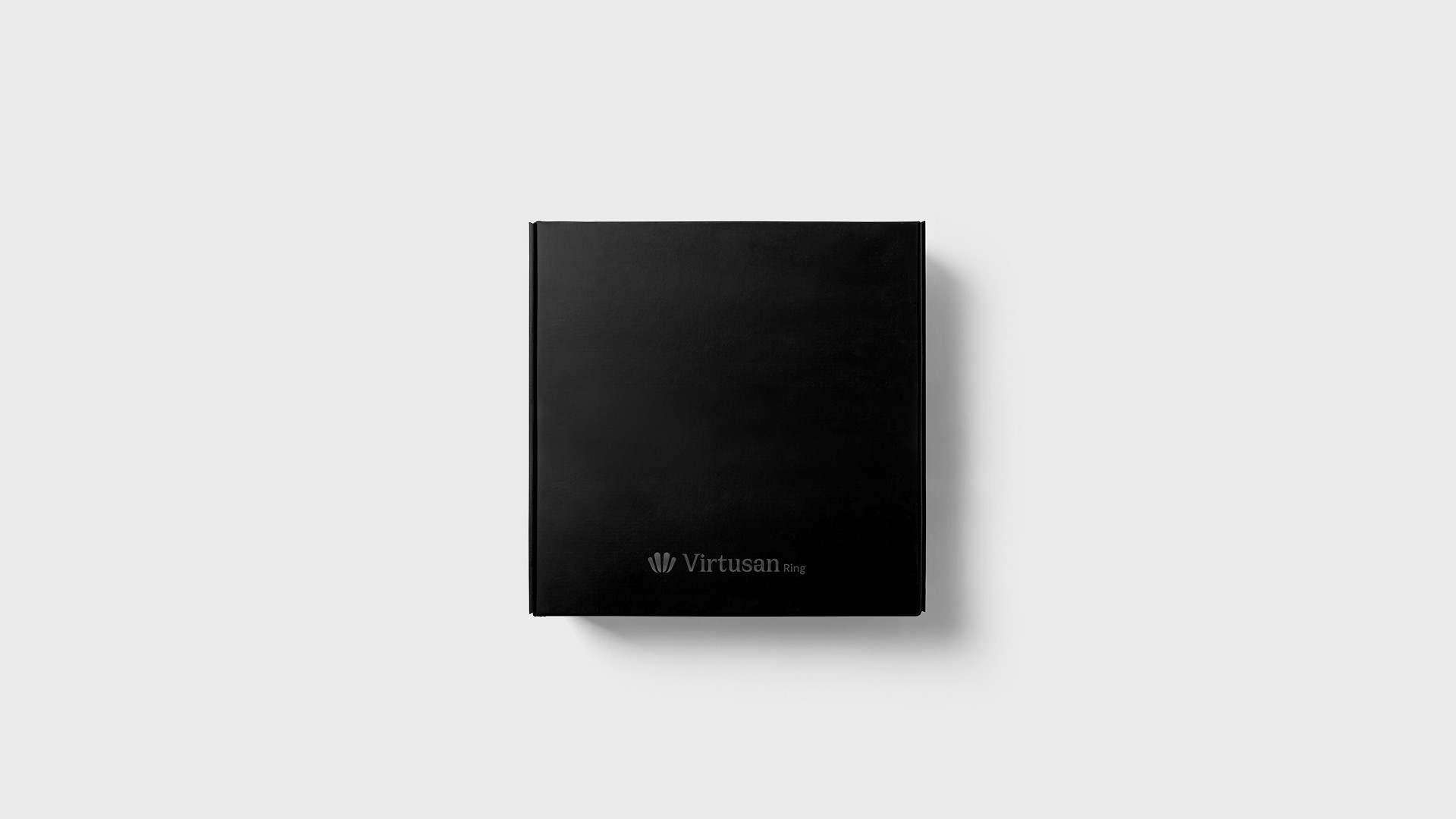
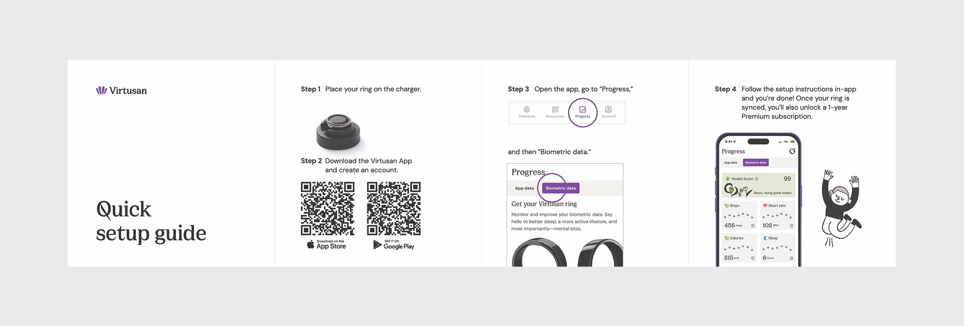
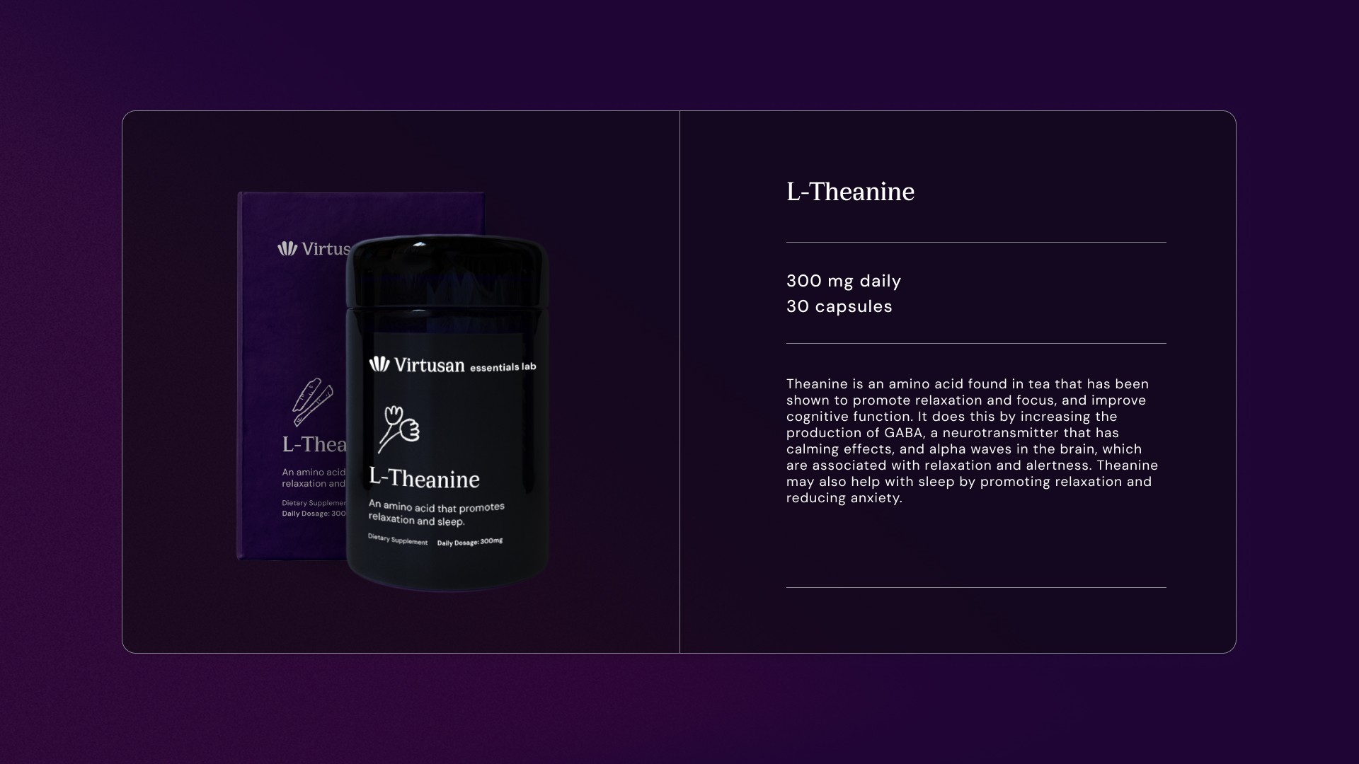
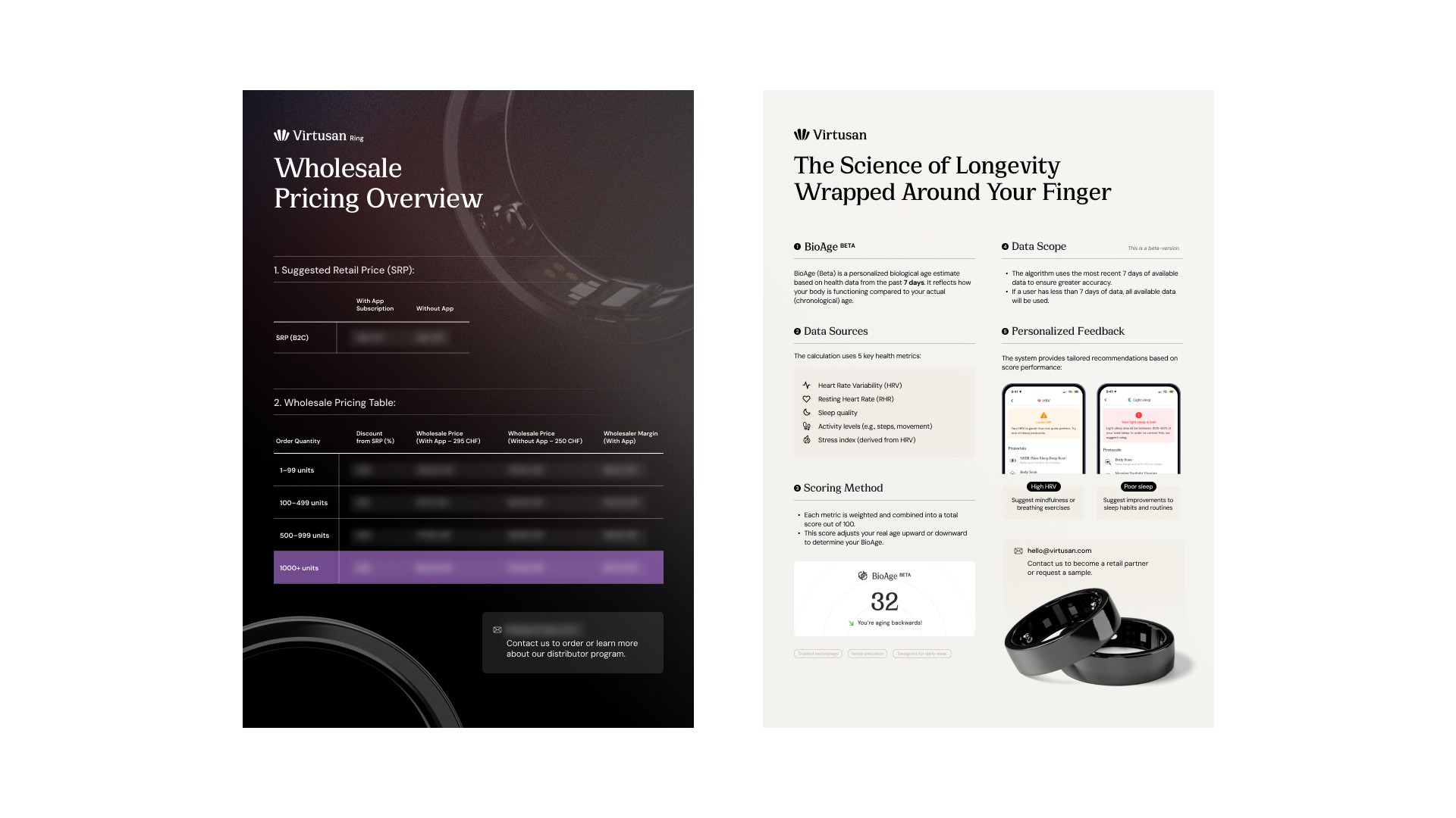
Package design
In addition to digital product design, I also worked on physical packaging. I designed the box and leaflet for the Virtusan Ring, as well as the box and container for the supplement product.